

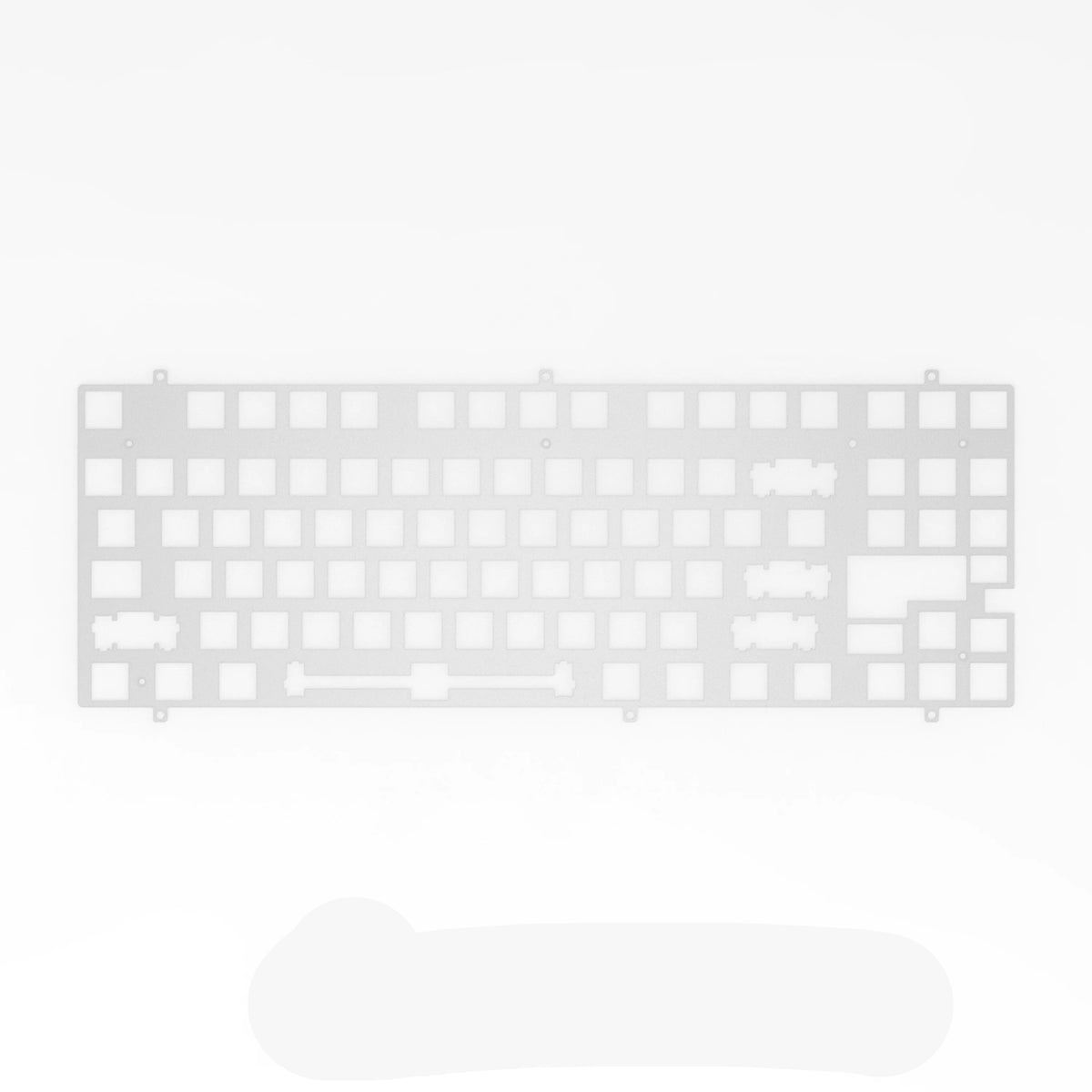
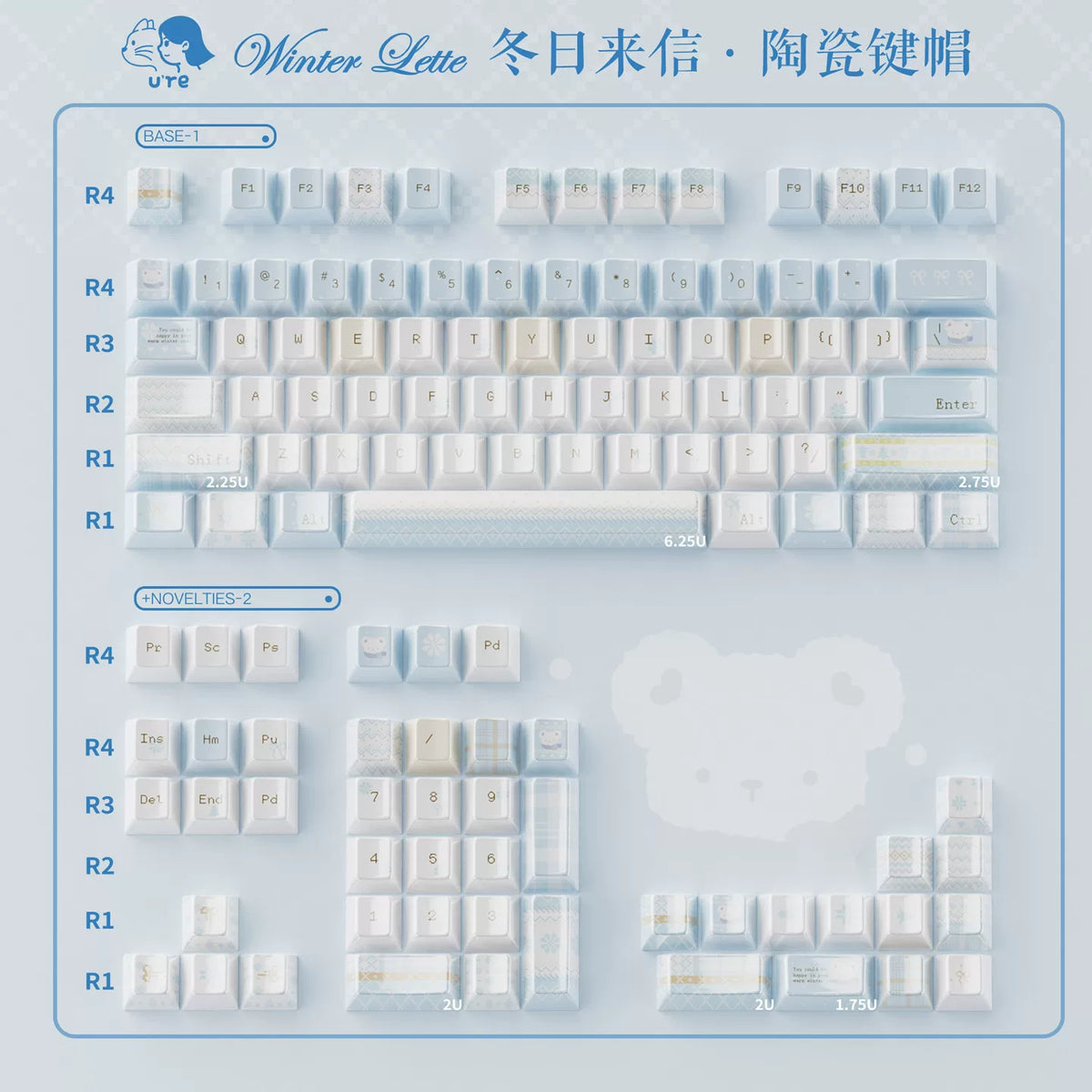
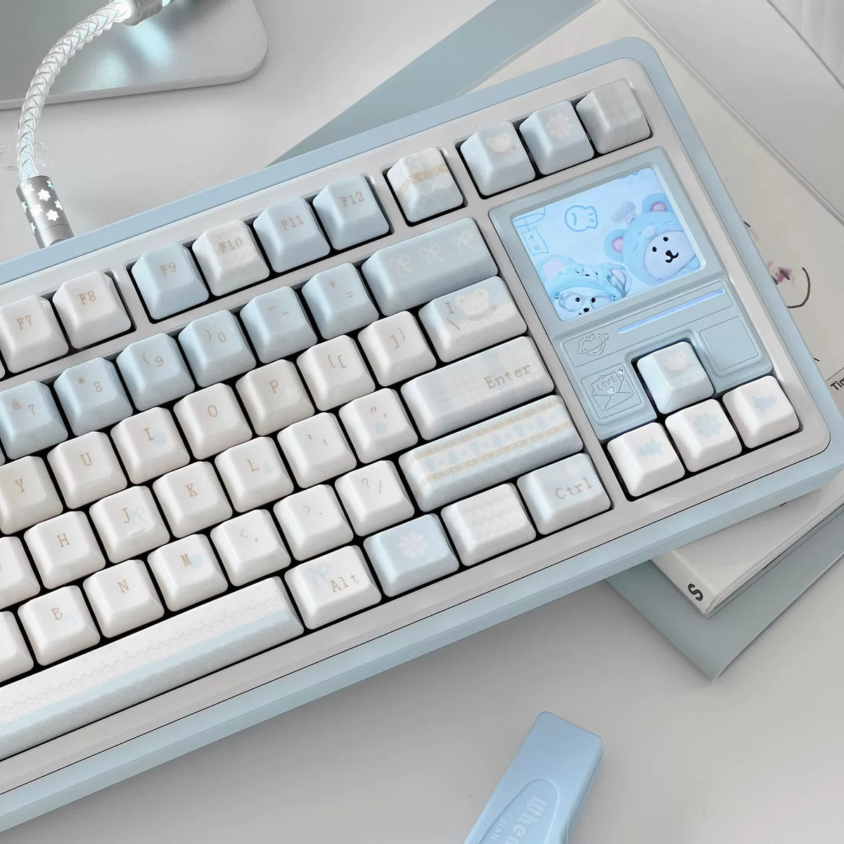
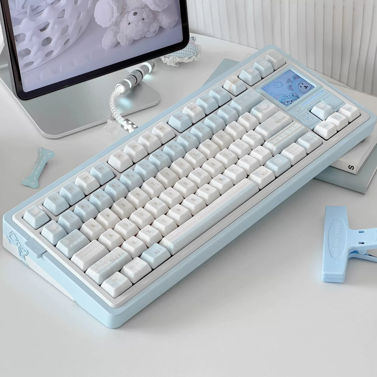
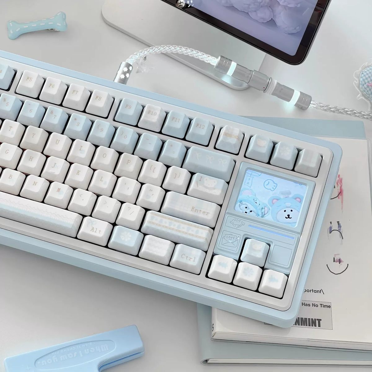
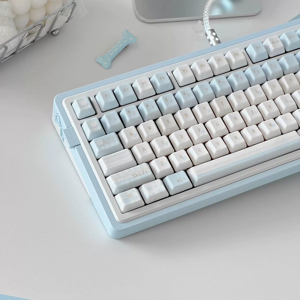
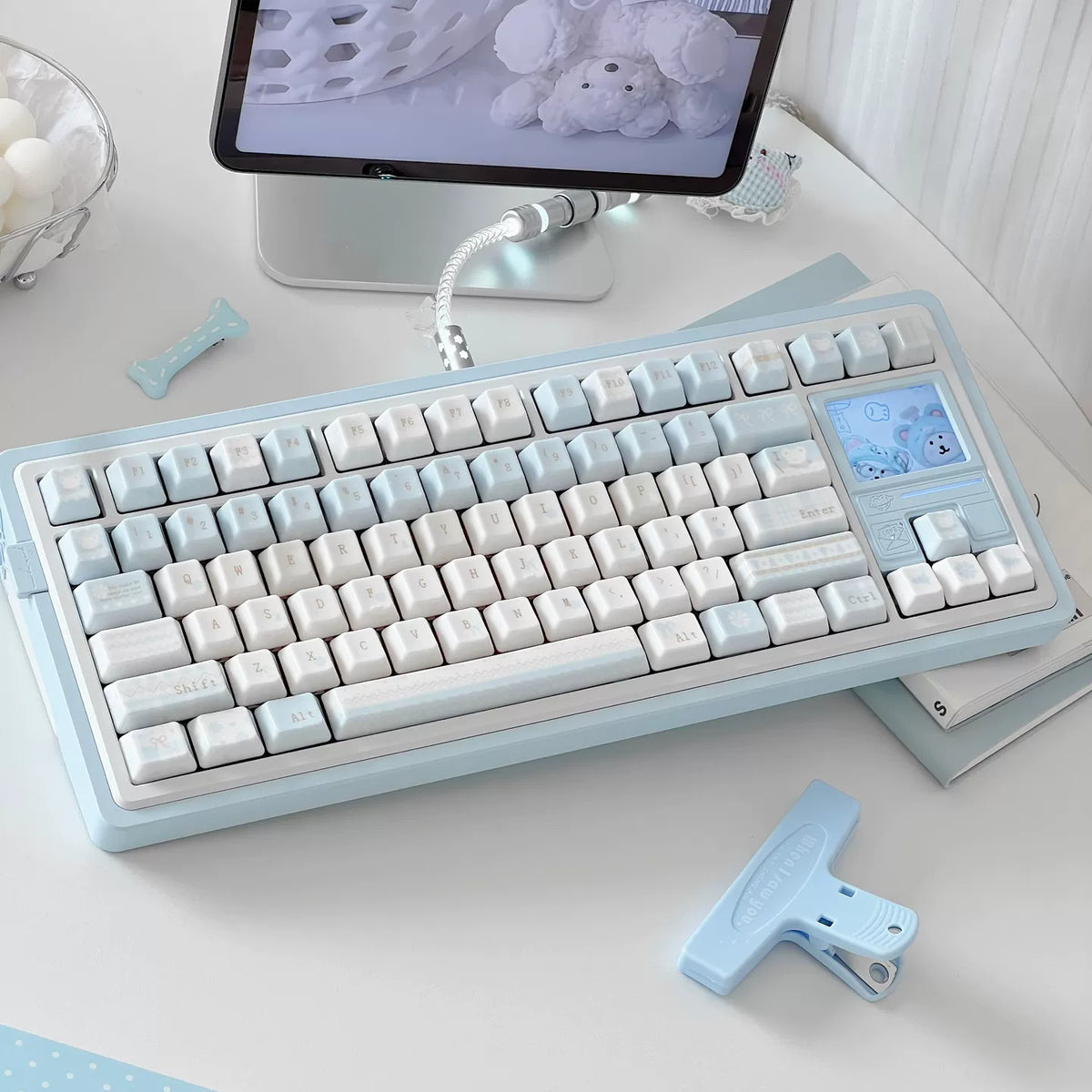

Most keycaps that call themselves ceramic are plastic with a glaze on top. Winter Letter is the other thing: every cap is fired ceramic, the same material as a porcelain cup, with the gloss, the weight and the cool touch that only the real material has. Press a key and you feel the difference immediately. The cap is heavier than plastic, so the switch bottoms out with a deeper, more solid note, and the surface stays cold under your fingertips for a moment before it warms. It is the closest a keyboard gets to feeling like a piece of tableware, and that is a compliment.
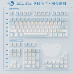
The design is a letter arriving on a winter morning. White alphas with soft gold-toned legends, modifiers in a pale ice blue, and the decorative keys carrying lace borders, ribbon bows, postage stamps and small frost motifs, the kind of details you would find on stationery rather than on a keyboard. A couple of the accent keys are done in a misty blue wash, so the set has depth without losing its calm.


